Today you will…
Think about different ways of hanging and displaying work, investigating how curators and gallery owners look for artists to produce a body of work for exhibitions. You will look at work that hangs well together, through subject, colour, size, materials.
Find out about triptychs, both paintings and photography, and how they emerged from early christian art to Francis Bacon’s 28 triptychs.
Design your own three images and write about how the images work together, as one image split, or as separate images joined by theme colour etc.
Consider how the use of colour, size and texture effects a piece of work and body of work.
You will need
• A large sheet of MDF cut into 20cm squares. B&Q may do this for you, if you give them notice. alternatively see if your dt department can do this. A large sheet will make 72 squares. • Pack of timber Battening 45mm x 20mm Cut into 23cm lengths, Two for each student Cable ties Two curtain rings
It’s often said that the way a work of art is displayed can reveal as much about the artist and his or her intentions as the image itself. And encouraging students to imagine a piece of art (or series of artworks) in its entirety before commencing with a new project can improve the quality of their creative output. A simple yet inexpensive way to get students thinking about how artworks are ‘choreographed’ rather than simply thrown together, is to study triptychs. Hailing from early Christian art, triptychs are traditionally paintings or carvings divided into three sections to create a multi-panel image – a format that is still commonly used today.
Re-popularised by artists such as Andy Warhol and David Hockney, triptychs provide the ideal inspiration for large-scale and collaborative works in the classroom and can be recreated with inexpensive materials such as MDF and timber battening. Students can research Warhol to look at multiples, and how triptychs emerged from early Christian art right through to how Francis Bacon painted his 28 trips, and how Hockney created the seasonal images featured in his current exhibition at the Royal Academy of Arts.

Starter activity
Divide students into groups of three. To do this, give each student one component of either a David Hockney, Andy Warhol or Francis Bacon triptych. Encourage them to mingle and discuss with one another the image in their hand in order to find the rest of their group (i.e the other parts of the triptych). They should not show their image to each other. Once they have found their partners they need to work together in their group of three to research the artist and picture. Ask students to think about themes or interests in the artist’s work that have influenced or built up to this triptych, and to discuss the similarities and differences between each part of the triptych. Discuss findings as a class.
After the class discussion has been brought to an end, ask students to sand and prime three square MDF panels and two lengths of battening each. You will need to drill holes for hanging.
Main Activities

1. Presentation issues
In their groups of three, ask students to discuss how triptychs can be displayed, for example vertically or horizontally, and how the method of display will alter the impression of the image. Use the David Hockney, Andy Warhol and Francis Bacon artworks as examples. Encourage them to discuss what they like about each presentation method, and what this adds to the overall impression.
2. Sketch show
Still in their groups of three, get students to discuss designs for a triptych, and to roughly sketch out their ideas, producing a set of three images that will work together. Ask them to consider what about Hockney, Warhol and Bacon’s work has influenced their basic design.
3. Group discussion
Join students into small groups of six or nine to discuss and swap their sketches. Encourage them to ask each other questions about what they have sketched and why, how the images will work together and individually, and what medium they think will work best.
4. The creation
Individually students should then paint or collage their designs onto the MDF using whatever medium they would like.
Home learning
Ask students to research other religious iconography, and put together a presentation. This could look at traditional or modern examples, or be a comparison of the two.
Summary
Arrange the finished triptychs into an art gallery. Ask students to choose either their own or someone else’s work to talk about the choices of colour, texture and subject matter. Encourage them to look for and discuss any influences from Hockney, Warhol and Bacon’s work, plus personal interests and experiences that may be evident in the triptych. Divide the class into three, and ask each group to arrange an art gallery. They will need to think about work that hangs well together, through subject, colour, size and materials. Groups should sketch a layout on paper, and then present their gallery to the rest of the class explaining their choices.
Info Bar
Stretch them further
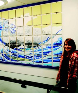
Ask students to produce a 20ft by 30ft multiple with the help of a class of younger pupils. they will need to work together to decide on a design as well as how this will be divided up and explained to the younger artists, each of whom will contribute one square to the artwork. students will also need to work out how the images are collated and organised to ensure they are arranged correctly. the final project can be displayed in the assembly hall.
About the Experts
No Added Sugar is a specialist participatory arts organisation managed by professional artists Toni and Gordon Dickinson, who have over ten years’ experience of partnership work with schools. Both partners exhibit individually and last year their work included: a sculpture for the Sailing Olympics,and work in The Autumn Show for The Royal West of England Academy. The artists deliver creative training and training for ‘Additional Funding for Schools’. For more information visit noaddedsugar.org.


